
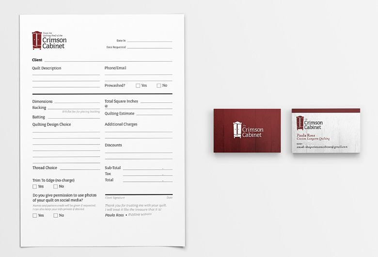
The Crimson Cabinet wanted a brand identity that captured the anticipation of discovering a beautifully crafted quilt. I designed a logo featuring a cabinet door left slightly ajar, creating a sense of curiosity and inviting customers to imagine the treasures waiting inside. The brand was extended across business cards, banners, intake forms, and other marketing materials. The cohesive identity gave her business a distinctive, memorable presence that reflected the quality of her craftsmanship. Since launching the brand, Paula has quilted more than 400 quilts for over 50 clients, earned multiple blue ribbons for her work, and continues to grow a thriving custom quilting business.
Logo/Branding
The Crimson Cabinet
Brand designer
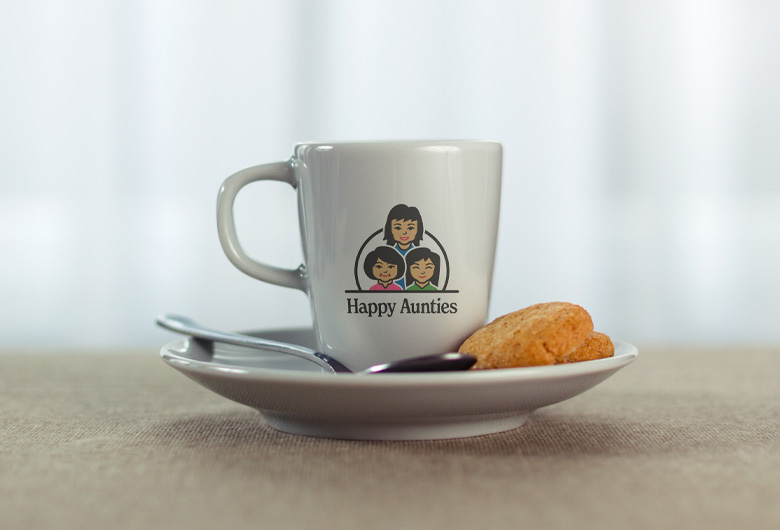
Happy Aunties is a Singapore-based business that connects friendly, experienced older women with retail sales opportunities. The challenge was to create a logo that featured a group of smiling Asian women while remaining simple enough to work effectively across every application. By reducing the illustrations to their most recognizable features and pairing them with a bright, cheerful color palette, I created a brand identity that feels warm, approachable, and instantly memorable. The final logo captured the client's vision perfectly and became a welcoming symbol of the company's mission to celebrate experience, positivity, and community.
Logo/Branding
Happy Aunties
Designer/Illustrator
RPG Sessions is an online tool to help facilitate playing with Narrative Dice System by Edge Studios. Unbound Legends needed a mark that would be recognizable to help solidify visual recognition of the tool. Today. RPG Sessions has over 40,000 users, over 100,000 characters made, and over 3 million dice rolls.
Logo/Branding
Unbound Legends LLC
Brand designer
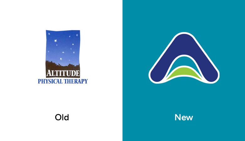
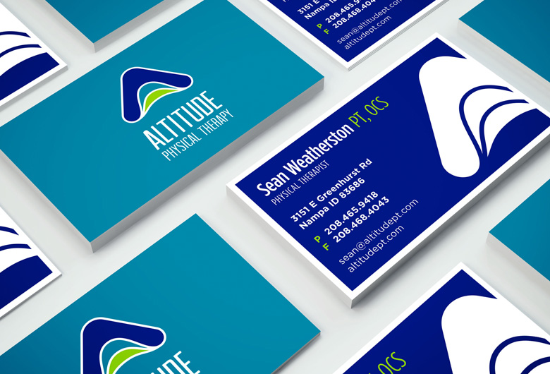
Altitude Physical Therapy needed a new brand identity that communicated care, movement, and progress without relying on the expected imagery of mountains or bodies in motion, while still symbolizing the idea of altitude. Through exploration of form and symbolism, I developed a logo that incorporates the shape of an “A” while suggesting movement through a subtle bending-leg motif. The result is a clean, approachable mark that connects the ideas of physical movement and rehabilitation with the name Altitude, giving the brand new life and a distinctive identity without relying on literal imagery.
Logo/Branding
Altitude Physical Therapy
Brand designer


© 2026 Jeff Ross Design LLC | Developed using the Foundation framework. You are awesome.